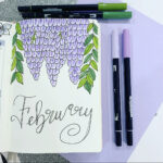
If you were to take a look at the original bullet journal website by Ryder Carroll, you’ll notice that the bullet journal is supposed to be simple and minimalist in its purest form. However, with the explosion of the bullet journal community in recent months, bullet journalists have really risen the bar on what bullet journals should look like. (Pinterest and Instagram are no help to this either.) And so, it’s become a thing that your bullet journal HAS to be decorated with pretty fonts and banners and full of color. Many feel intimidated by this citing that they have no artistic ability and they can never make their bullet journals look so pretty. I’m here to tell you that everyone has the ability to make their pages come to life with a few helpful tricks that ANYONE can do. So let’s begin with what I like to call my bullet journal cheats: easy ways to make your bullet journal look pretty without being an artist to begin with.
Now let me tell you, I am by no means a professional artist; I’ve just learned that by perfecting certain fonts, and doodles, you can make yourself look like a pro. Fake it till you make it, right?
So the best way I can even begin to explain this is by simply showing you what I’ve learned. In the video below, I go over easy tricks that you can use for lettering, headers, and separators. These are some simple tricks that I’ve learned along the way that I’m now passing along to all of you to not only feel inspired, but to bring out the inner artist you didn’t even know you had. Enjoy!

